This companion guide extends the Deployment article by drilling into the Design tab of the builder. Each subsection mirrors the UI panels, allowing you to follow along step-by-step as you configure your chatbot’s visual and interactive elements.
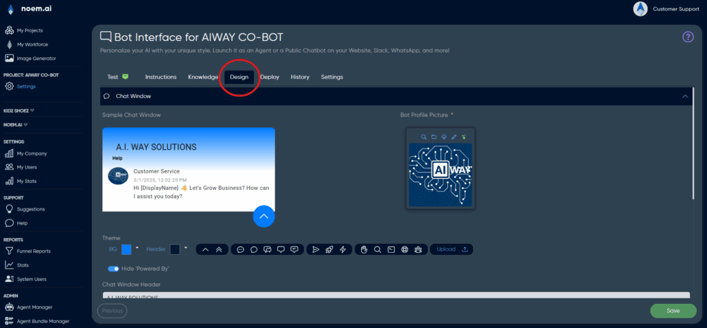
1. Opening the Design Tab #
Navigate to Design in the top navigation bar of your chatbot builder interface. This section manages the visual presentation of your chatbot, including colours, branding, messages, and interactive prompts. All changes here apply immediately, meaning the interface updates live. It’s crucial to treat this as real-time editing rather than a draft environment—each change directly impacts user experience instantly.
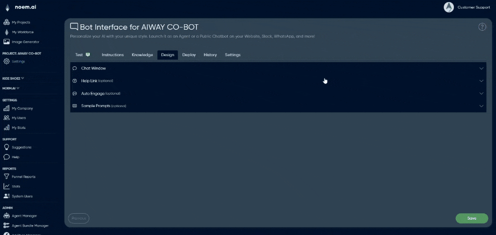
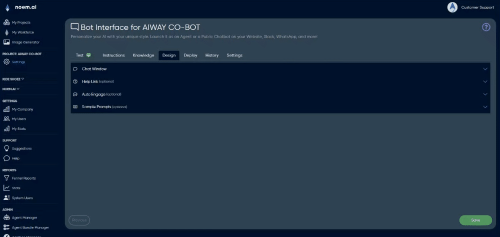
2. Chat Window #
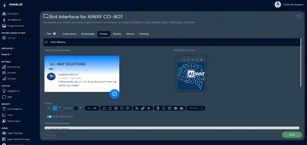
2.1 Theme #
BG (Background) / Header Colours
Two colour pickers control the chat window’s gradient background. Colours can be selected via an RGB hex input or from the built-in palette. The final appearance is generated using a vertical CSS gradient (linear-gradient(0deg, BG → Header)), creating a visually engaging backdrop. If a solid colour is preferred, ensure both BG and Header colours match exactly.
Hide “Powered By”
A toggle option enables you to remove or show vendor attribution in the chat footer. Hiding attribution can impact compliance with certain usage policies or terms of service, so ensure your licensing permits this action before disabling it. (You need to be on a higher tier plan)
2.2 Branding Fields #
Chat Window Header
Enter the text that will appear prominently above every new conversation in bold. This header typically contains your chatbot’s name or the associated product/service name. There’s a character limit of 60, and any text exceeding this will automatically truncate with ellipses (…). Keep it clear, concise, and instantly recognisable for users.
Display Name
This field defines the chatbot’s visible persona name appearing next to its avatar in every chat bubble. It should be consistent, as changes can confuse conversation history and context recognition if your bot leverages the display name in any system prompts. Choose a user-friendly, relatable persona name aligned with your brand voice.
Bot Profile Picture
Upload your chatbot’s avatar or branding image here. The interface automatically crops images to a 1:1 square aspect ratio and resizes them to 96 × 96 pixels, storing an additional higher-resolution (retina) version. PNG with transparent backgrounds is recommended, although JPEG uploads will automatically convert to PNG format. This image is the visual representation of your chatbot and should be carefully chosen to reflect your brand.
2.3 Initial Engagement #
Initial Welcome Message
Use the provided rich-text editor to craft your chatbot’s opening message. Supported formatting includes bold, italic, bullet points, inline code snippets, clickable hyperlinks, and emojis. HTML sanitisation automatically strips unsafe tags, scripts, and iframes for security. The welcome message is purely visual—it’s rendered on the client side and does not interact with the chatbot’s logic or backend models.
Auto Popup After X Seconds
You can specify how many seconds (from 0 to 120) the chatbot waits before automatically popping open on a visitor’s screen. Setting this value to 0 disables auto-popup functionality. This timer resets once per browser session, preventing users from experiencing repeated popups unless they clear their cookies or start a new browsing session.
3. Help Link (optional panel) #
The Help Link panel allows you to provide users with quick access to helpful information such as FAQs, support details, or privacy statements without leaving the chat interface.
Link Text
This sets the visible anchor text shown in the chat window header. If left blank, the help button will be hidden entirely. Keep this text short and intuitive to encourage clicks without crowding the interface.
Help Text
Use the rich-text editor to create the content displayed in a modal popup when a user clicks the Help Link. The help content supports standard formatting, including bold, italic, lists, links, and emojis. Since this modal opens inline, it cannot load remote or external HTML. This feature is best suited to static content, such as FAQ snippets or escalation instructions. Content length should be concise (less than ~20 KB) to maintain readability and ensure optimal loading performance.
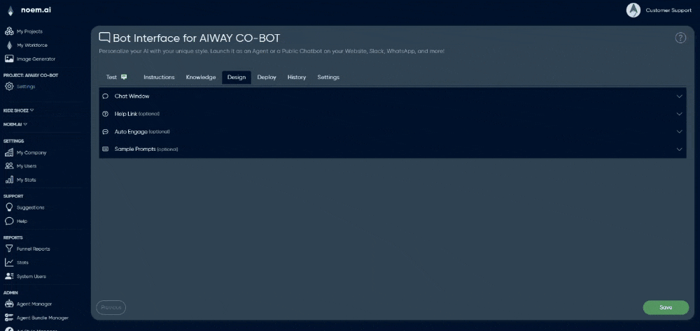
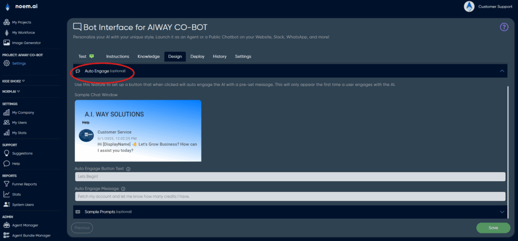
4. Auto Engage (optional panel #
4.1 Behaviour #
Auto Engage displays a floating call-to-action (CTA) button to first-time visitors. Once clicked, this CTA initiates interaction automatically, helping guide users toward useful or predefined chatbot actions. This functionality relies on browser cookies, appearing once per visitor unless cookies are cleared.
Auto Engage Button Text
Define the text displayed within the CTA button, ideally short and action-oriented, such as “Let’s Begin!” or “Start Chatting!”. Shorter button text ensures readability, especially on mobile screens.
Auto Engage Message
The message entered here is automatically sent on behalf of the user when the CTA button is clicked. As this message is treated exactly like user input, it does pass directly to the chatbot’s backend for processing and response generation. Ensure your message is explicit and concise, forming a complete sentence or clear command.
4.2 Best Practice #
- Limit the Auto Engage message to one specific task or action to simplify chatbot processing and ensure immediate, relevant responses.
- If you use placeholders (e.g.,
{{accountId}}or{{displayName}}), confirm that your middleware or integration logic populates these values before passing the message to the chatbot. Otherwise, the chatbot will treat them as literal text.
5. Sample Prompts (optional panel) #
This feature allows you to offer users predefined example questions or prompts at the start of a new conversation, helping guide user interactions.
Prompt List
Add prompts to the list by typing into the provided input field and clicking the plus (+) button. Prompts appear to users as clickable buttons (chips). You can reorder prompts by dragging and dropping them within the list. This allows you to prioritize certain prompts over others easily.
Show Different Prompts for Mobile
When toggled, this feature activates a separate prompt list tailored specifically for mobile devices, which may have screen size or readability considerations. Without separate mobile prompts defined, the default desktop prompts automatically appear on mobile as a fallback.
Guidance #
- Keep prompts under 80 characters to ensure they remain readable and neatly formatted, especially on mobile.
- Phrase prompts conversationally, using second-person phrasing, e.g., “How do I reset my password?”.
- If Auto Engage is enabled, the sample prompts will not initially appear, preventing the screen from becoming cluttered on first user interaction.
6. Versioning & Rollback #
Each change made in the Design tab saves a timestamped snapshot to your configuration history, accessible under History → Config Snapshots. You can roll back changes at any time by selecting a previous configuration snapshot. However, remember that rollback affects only textual and configuration-based elements—uploaded images and other assets stored externally may not restore if deleted.
7. Testing Your Design #
Always test your chatbot design thoroughly before making it available to users:
- Switch to Test mode from the top bar to preview interactions in real-time.
- Use the device emulator dropdown to ensure your chatbot interface renders correctly on different devices: mobile, tablet, or desktop.
- Clear your browser’s local storage or use incognito/private browsing sessions to simulate the experience of a first-time visitor. This is essential for testing features such as the Auto Engage popup.
8. Summary #
The Design tab provides the tools to control your chatbot’s visual identity and user experience without affecting backend logic or conversational models. Approach configuration methodically: start with visual basics in the Chat Window, move on to adding helpful context via Help Links, encourage initial user engagement with Auto Engage, and finally, offer helpful prompts to guide ongoing interactions. Separating presentation from chatbot intelligence allows flexible, risk-free iterations on visual and interactive elements, empowering your team to optimize chatbot UX independently of core technical configurations.


